.jpg)
Curio Hotels: Refining the hotel reservation experience
Timeline
-
January - March (12 weeks)
My Role
-
Solo project: Responsible for research, analysis and design
PROBLEM
What happened to less is more?
With the proliferation of internet access and the rise of online travel agencies and hotel booking platforms, consumers have increasingly turned to digital channels to search for and book accommodations.
Whilst conducting primary research it became evident that hotels were adopting the ‘more is more’ method resulting in bombarding users with too many choices, too many buttons and too much background noise.
SOLUTION
LIMIT CHOICES
01
-
Guiding users towards options that are more likely to meet their requirements.
-
Streamlines the decision-making process for users, preventing overwhelm.
-
Reduces decision paralysis and helps users make faster, more confident choices.
MAKE IT OBVIOUS
02
-
Reassures users that their choices are accurately recorded and reflected in the booking process.
-
Fosters trust and reduces uncertainty, encouraging users to proceed with bookings.
-
Removes ambiguity, provides clear cues, leading to a more satisfying and frictionless experience.
MAKE IT RELEVANT
03
-
Users remain focused on their primary goal
-
Minimises cognitive load
-
Relevant content guides users through the booking journey without unnecessary detours
-
All content directly supports the booking process, resulting in the optimisation of conversion rates
RESEARCH
Goals: Staying informed; identifying opportunities for improvement and innovation; capturing user context and goals; ensuring that products and services meet the expectations of users in a competitive market; identifying common interactions and pain points.
Competitive Benchmarking
I examined 4 brands, each representing different approaches to the digital hospitality sector.

Surveys*
I designed and distributed a short survey investigating user preferences and recent experiences booking a hotel.

Usability Tests
I observed and documented insights from six usability tests, two of which I designed and conducted independently.
Premium brands have a sleeker, more streamlined flow
63% of users last visited a booking website to book a stay (6 IN 16 VISITED TO BROWSE)*
Pictures and reviews were the top 2 most important features for users*
ANALYSIS


Customer Journey Map
Next I built a customer journey map, aggregating all of my findings into a concise visual representation of the average customer journey.
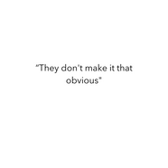
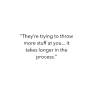
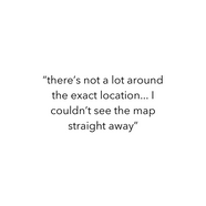
USER QUOTES
CONCEPT
Flow Diagram and Interaction Design
With my key findings organised I was now able to create the high-level booking flow for my website, a minimal friction ‘happy’ path. I then used this flow to sketch each screen state using pencil and paper
DESIGN
Design, refine, repeat
Using the interaction design and flow diagram I developed a high fidelity prototype using Figma.
After designing I received feedback from mentors and peers in order to see if I had met my key objectives: limit choices, make it obvious and make it relevant.


Limit Choices
Homepage
Upon identifying that most users visit with the primary intention of booking a hotel rather than perusing offers, I streamlined choices on the homepage, prioritising simplicity. While browsing offers and all available hotels remains a clear option within the primary navigation, I focused attention on the central search bar. Through centre stage placement, clear icons, and a bold call-to-action, I ensured that the search feature stood out as the most prominent and easily accessible element.
Incorporating a carousel of hotel pictures as the background offered users the opportunity to browse seamlessly alongside the main search bar. It also enabled me to maintain a clean interface while simultaneously minimising excess blank space and distractions.


Filters
Research indicated that users were feeling overwhelmed by the abundance of filter options, with users highlighting the failure of existing platforms to find the right balance between offering too many or too few choices.
To address the issue of decision paralysis, which is proven to hinder progress, I opted to limit the filters to the most commonly used. This approach allows users to maintain autonomy over their search while mitigating the risk of decision fatigue.
Whilst designing the filter pop-up I also included a variety of buttons, sliders and switches to make the task more visually compelling.


Extras
.png)
Many users expressed feeling overwhelmed by the multitude of choices, even describing the websites as 'sly' and 'pushy' in their approach to extras. To address this, I once more restricted the options to the most prevalent, consolidating them onto a single page to prevent the feeling of having to 'root' through information. Additionally, I incorporated an open input feature to show users that their voice and preferences are valued during the booking process.
Make it Obvious
Progress Bar
A key feature of my website is the progress bar at the top of each page which guides users seamlessly through each step of the booking process, from search results to payment. By providing transparency regarding the number of steps as well as the goal of each step, users can navigate with confidence and clarity, reducing ambiguity and encouraging users to keep moving forward.

CTAs
My research revealed that users often struggled to locate CTAs for viewing the map, accessing more information, and, most crucially, booking selections. To address this issue, I made sure that all buttons were prominently displayed with bold colours and icons against a neutral backdrop, ensuring their visibility on every page. This approach aims to maintain booking momentum and prevents users from missing key actions.


When making a selection does not prompt a complete change in the screen state, I used colour to provide immediate system feedback. This assures users that their actions are being executed, in turn, sustaining booking momentum.

Booking Summary
I Included a breakdown of all of the users selections, what is included in their stay, the costs, and the opportunity to edit their choices. I decided to keep this summary separate from the extras or payment page to ensure users can focus on a single task - confirming the accuracy of the booking - without having to split their cognitive load across multiple tasks on one page.
.png)
This enables users to proceed to payment confidently, free from any last-minute hesitations or uncertainty regarding their purchase.
Make it Relevant


To enhance the user experience of the booking website, I prioritised the relevance of information by only revealing it when pertinent to the current step.
For instance, when the user is choosing a room, I avoided adding redundant hotel descriptions or unnecessary pictures, recognising their irrelevance to the room selection process. To ensure I wasn't sacrificing information for simplicity I added buttons to provide more detailed information when requested by the user.
This approach aimed to streamline the decision-making process, eliminating the need for users to scroll through extraneous information.

I avoided cluttering the interface with excessive marketing or internal advertisements, recognising that they could detract from the primary goal of booking. Research revealed that many users found it frustrating to constantly encounter random deals or blog posts which were unrelated to their current booking, so I segregated this content into a separate tab in the primary navigation bar.
This approach provides users with the choice to explore additional information if it aligns with their goals, whilst being freely avoidable if it's not relevant.
.png)
In designing the thumbnail view for each hotel, I emphasised the images as the primary visual, while also prioritising reviews, price, and a prominent CTA in the hierarchy. My aim was to steer clear of showcasing less impactful information about the hotel upfront, aligning with my research findings which determined pictures, reviews, and price as the most relevant features for users.


PROTOTYPE
REFLECTION
-
In order to assess the efficacy of this website, I would conduct further usability tests to confirm the website is able to fulfil user goals with minimal friction. I would predict higher than average conversion rates using this design due to it's accordance to Hick's law and usability heuristics.
-
An A/B test would also be beneficial if additional components were to be added in the future. This would enable you to monitor whether an increase in specific options, information, or elements are directly correlated with lower conversion rates.


